Medieninformatik
Website Redesign
OVERVIEW
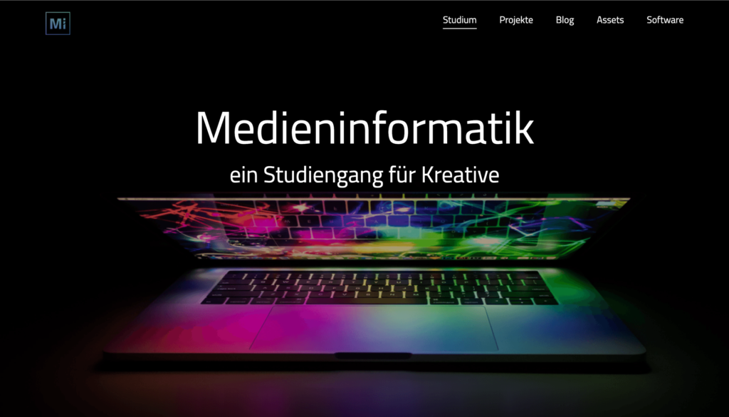
As part of a university project, we undertook the redesign of the Media Informatics website, aiming to provide an insightful overview of the study program and potential future career prospects for Media Informatics students. As requested by the stakeholders, the revamped website should also features a comprehensive overview of free software resources and an integrated asset platform.
TOOLS
- Figma
- Miro
- WordPress
CONTEXT
- University Project,
- Teamsize of 7
- Subteams of 2/3

Background & Goal
Before embarking on the redesign of the Media Informatics website, our initial goal was to create an alumni platform. However, after conducting thorough user research, we discovered that there was a limited demand for such a platform. As a result, we shifted our project’s focus to better address the needs and preferences of our target audience.
Accordingly, a new idea was developed, the goal of which was finally to provide a website that serves as a valuable resource for current and prospective students to gain information about the media informatics study. We considered several parts of the website that we had to tackle and divided ourselves into three subgroups for the implementation and detail work, whereby I and two other team members were responsible for the asset part.
Throughout the project, we faced several constraints, such as limitations imposed by the university’s computing center and permissions related to the website. Another factor was that it was decided that we were to work with WordPress, which also had its own set of limitations in terms of available options and functionalities, and that we had a tight time frame since this was a university project, that should be launched before the start of the coming semester. Despite these obstacles, we successfully adapted to the situation and explored suitable alternatives within the WordPress ecosystem. This experience not only demonstrates our ability to pivot and respond to user needs but also highlights our adaptability and problem-solving skills in the face of technical and time constraints.
The process
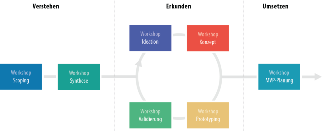
During the development process of the Media Informatics website redesign, we embraced the concept of Collaborative UX Design, as outlined in the book „Collaborative UX Design: Human-Centered Methods to Improve Collaboration“. While adhering to the core principles of this approach, we had to make adjustments to accommodate our tight timing schedule and the smaller scale of our project.
Our team effectively organized the collaborative design process, ensuring efficient communication and decision-making among all team members. We worked together to prioritize key stages, such as user research, ideation, prototyping, and testing, while maintaining a strong focus on user needs and preferences.
Understanding the User
To ensure a thorough understanding of our users, we developed three distinct personas representing key user groups: a student, a creator (who could also be a student), and an administrator, that has to upkeep the website. These personas allowed us to identify and address the unique needs of each group, ensuring that our website redesign catered to their specific requirements and expectations.
can also be seen outside the nursery. For the lighting, we decided on one ceiling lamp per room, as is usual for a scene in a closed room. In addition, there is a bedside lamp in the bedroom, to which we also added a light source. In the hallway there is also a wall lamp next to the door to the room. As soon as the girl presses the light switch, the intensity of the light in the children’s room changes from 100% to 0%.

Understanding the problem
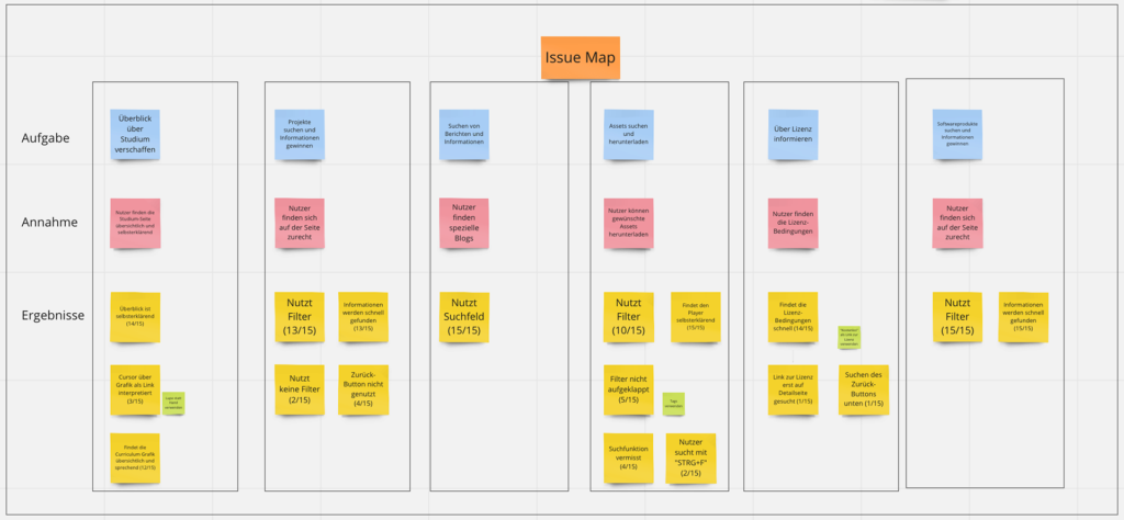
To gain a deeper understanding of the challenges our users faced, we created a problem statement map that helped us identify key issues to address during the website redesign. Some of the main problems we discovered included:
- Prospective students were unclear about the content and structure of the various modules in the Media Informatics program.
- There was a lack of clarity regarding the overall experience and expectations of the Media Informatics program.
- Users found it difficult to navigate the numerous contact points and resources available, leading to confusion and inefficiency.
- Students and creators struggled to find suitable software for their private or academic projects.
- There was a need for a centralized platform to locate appropriate assets for use in private or academic projects.

Ideation
With a clear understanding of the problems our users faced, we moved into the ideation phase of the project. This stage involved brainstorming creative solutions and strategies to address the challenges identified in the previous phase. Our team employed various ideation techniques, such as sketching, and group brainstorming sessions, to encourage open communication and the free flow of ideas. As we explored potential solutions, we kept the needs and expectations of our personas – the student, the creator, and the administrator – at the forefront of our discussions.


Concept
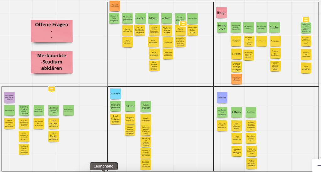
After completing the ideation phase, in the next workshop we moved on to the concept development step, where we consolidated our most promising ideas into a cohesive and comprehensive vision for the Media Informatics website redesign. Hereby, we looked at the most important steps in the interaction with all pages and everything that is necessary for those.
Wireframing
During the development process, we conducted two wireframing sessions, in which our team split into their smaller subgroups to create multiple design drafts. These sessions allowed us to explore various design approaches and gather diverse perspectives from team members.
After each wireframing session, we organized feedback sessions with the entire team and the project stakeholders. Throughout these meetings, we presented our design drafts and collected notes and suggestions for improvements. This collaborative approach enabled us to identify the most effective design elements and incorporate the valuable input of our peers and stakeholders.
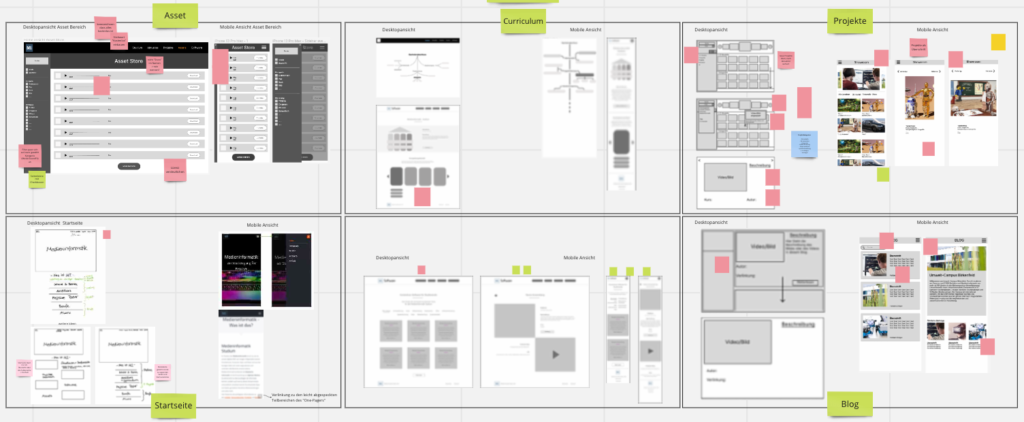
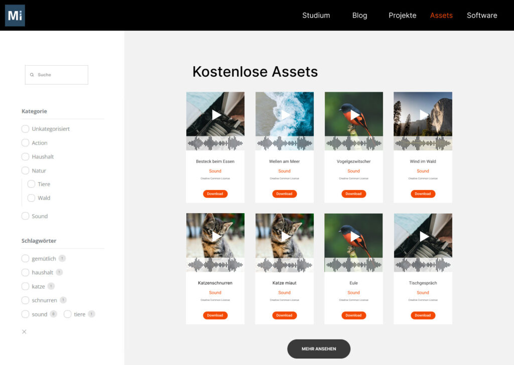
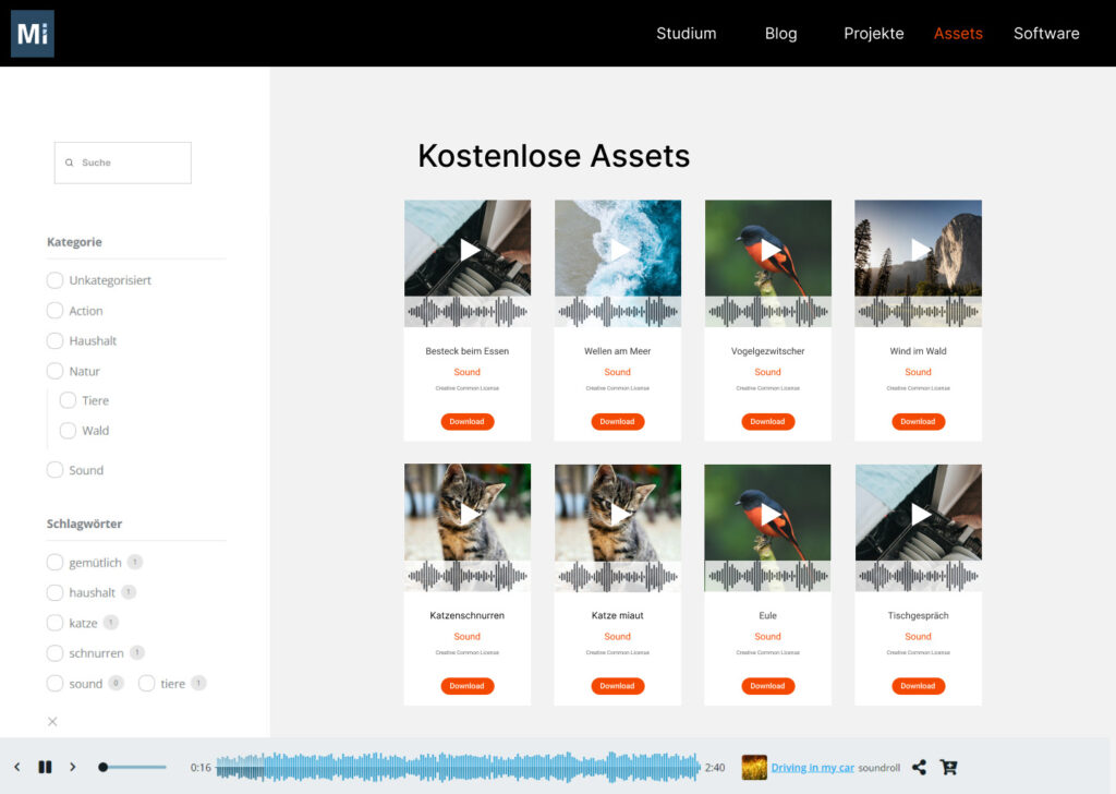
For the asset part, we found a suitable plugin in this step and adapted our wireframes to it, so that they included all the previously developed concepts and at the same time met the technical requirements. By iterating on our wireframes and incorporating feedback, we were able to refine our design concepts and move closer to a final solution.
Implementing in WordPress
Finally, the implementation in wordpress was still missing, with which we wanted to carry out our user tests afterwards. We bought the necessary plugin and implemented everything according to the previous planning.
Validation
In the final stage of our project, we focused on validating our design concepts to ensure that the redesigned Media Informatics website met the needs and expectations of our target audience. To accomplish this, we conducted multiple usability tests with diverse participants who matched the profiles of our personas. These tests allowed us to observe how real users interacted with our design and provided invaluable insights into potential areas for improvement.
Following the usability tests, we also conducted a survey to gather additional feedback and gauge user satisfaction with the redesigned website. This step further confirmed the effectiveness of our design choices and provided us with valuable quantitative data to support our decisions.
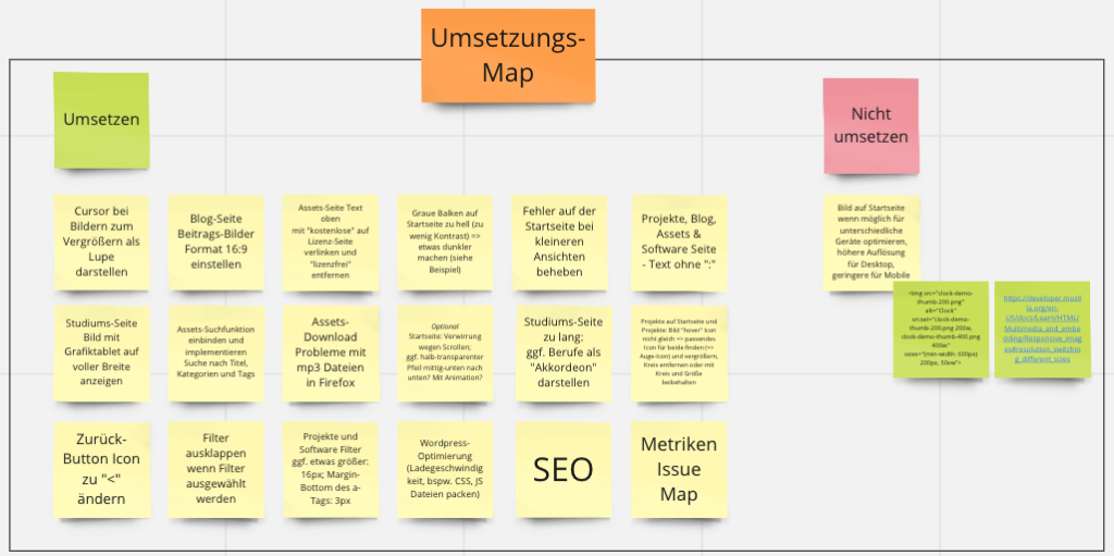
With the valuable feedback and input from our usability tests, surveys, and stakeholder consultations, we refined the design and prepared the website for launch.
